
Case study 01 — Mobile application design
TripRankDrive smarter. Rank better.
A night-first iOS app that turns every drive into a readable score, a live safety layer and a rank worth chasing — designed end to end from research to a 15-screen shipped system.
- Product
- TripRank — drive tracking & ranking app
- Platform
- iOS first, Android parity
- My role
- Senior UI/UX Designer — research → UI → handoff
- Scope
- Product strategy, IA, flows, UI system, 15 screens
- Timeline
- 5 weeks, 3 design sprints
- Deliverables
- Design system, prototype, store creatives, handoff
Chapter 02
The problem
Why another trip tracker
Trip data with no meaning
Existing trackers dump raw numbers — km, minutes, an average. Drivers see a spreadsheet and never learn what a good drive looks like.
Dashboards you cannot read at 100 km/h
Small type, low contrast, six taps to start. Anything that needs reading while moving is a safety problem, not a feature.
No reason to open it tomorrow
Tracking alone has a one-week half-life. Without progression, comparison or streaks, retention collapses after the novelty drive.
Paywalls that arrive before the value
Competitors gate the first trip. Users never feel the product work, so the upgrade reads as a toll instead of an upgrade.
Chapter 03
Research
What drivers actually said
31
driver interviews
commuters, weekend riders, delivery pros
7
apps teardown
speedometer, fitness and racing categories
68%
wanted comparison
“Am I better than yesterday, or than anyone?”
4.2s
glance budget
max safe time eyes leave the road at speed
“I don't want a report. I want to know if today was better than yesterday — in one look, without taking my eyes off the road.”Interview 14 — daily commuter
Chapter 04
Who we designed for
Four drivers, one dial
Abhinav, 26
Weekend riderWants a score and a rank to chase. Screenshots his top speed for the group chat.
NeedsLeaderboard position, top-speed badge, shareable trip card
Meera, 34
Daily commuterWants the same route to get calmer and cheaper, not faster.
NeedsConsistency score, distance trend, auto-start so she never taps
Salman, 41
Fleet / delivery driverNeeds proof of hours and distance without babysitting a screen.
NeedsTrip history export, duration accuracy, background reliability
Kai, 22
Car-culture creatorComes for the render, stays for the rank. Posts builds daily.
NeedsAI Mode styling, image export, profile as identity
Chapter 05
Design principles
The rules we designed against
One number owns the screen
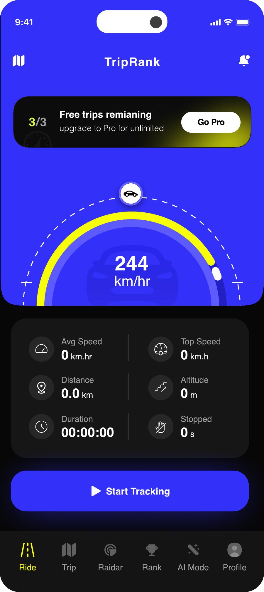
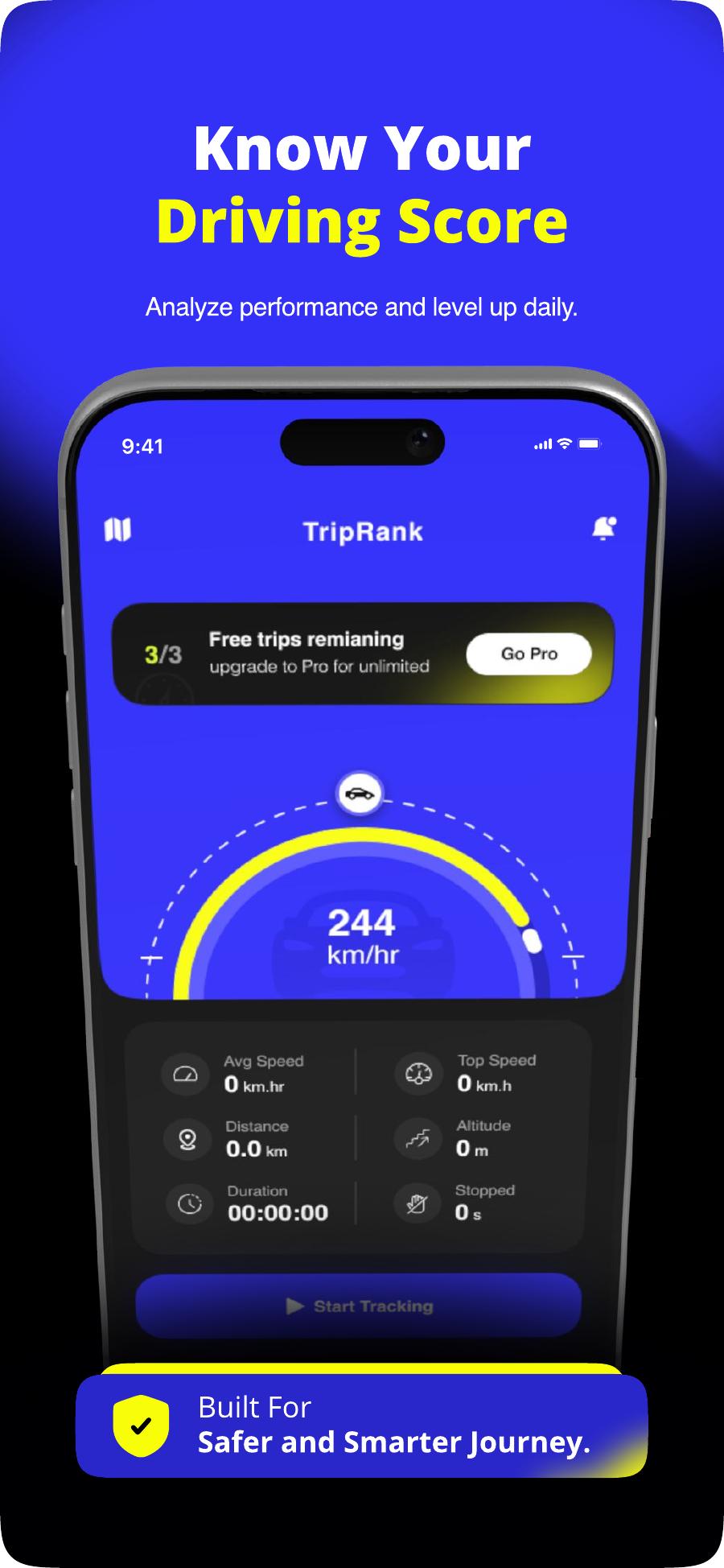
The speed dial is the anchor of the whole product. Everything else is secondary metadata around a single 244 km/hr readout.
Night-first, glare-safe
True-black canvas, electric blue for action, volt yellow for alerts only. No white surfaces — a white card at night is a flash in the windshield.
Two taps to record
Open → Start Tracking. Permissions, profile and paywall never stand between a driver and the first trip.
Earned, then asked
Three free trips ship the value first. The Go Pro pill sits in the header — visible, never blocking.
Progression as the loop
Every trip ends in a rank delta, not a dead end. Complete → compare → chase.
Chapter 06
Information architecture
Six tabs, no menus
Live HUD, speed dial, start / end trip, radar alerts
History, filters, per-trip stats, trip complete card
Live speed-camera and risk zones near you
Global leaderboard by top speed, distance and trips
Style builder, custom prompts and nano edits for car renders
Stats, units, auto-start, subscription and support
Onboarding → first trip
- 01
Splash
Brand mark, 800ms, permissions pre-warmed in background
- 02
Onboarding
Three value cards — tracking, score, radar — each skippable
- 03
Profile
Name plus country: the minimum needed to place you on a board
- 04
Home
Idle HUD with 3/3 free trips and one primary action
- 05
Recording
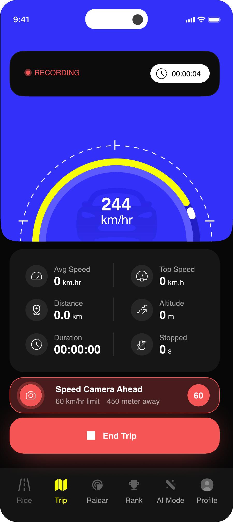
Full-bleed dial, live radar warnings, single End Trip
- 06
Complete
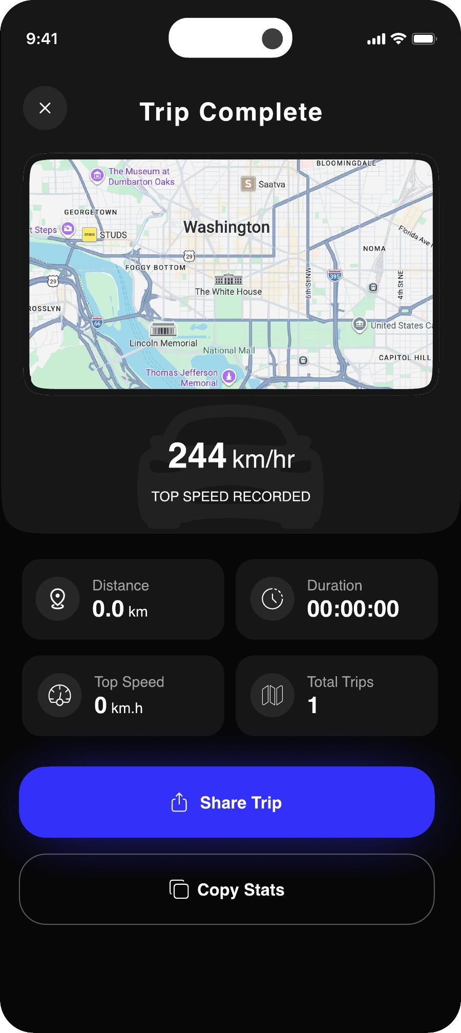
Top speed hero, stats grid, share and copy
- 07
Rank
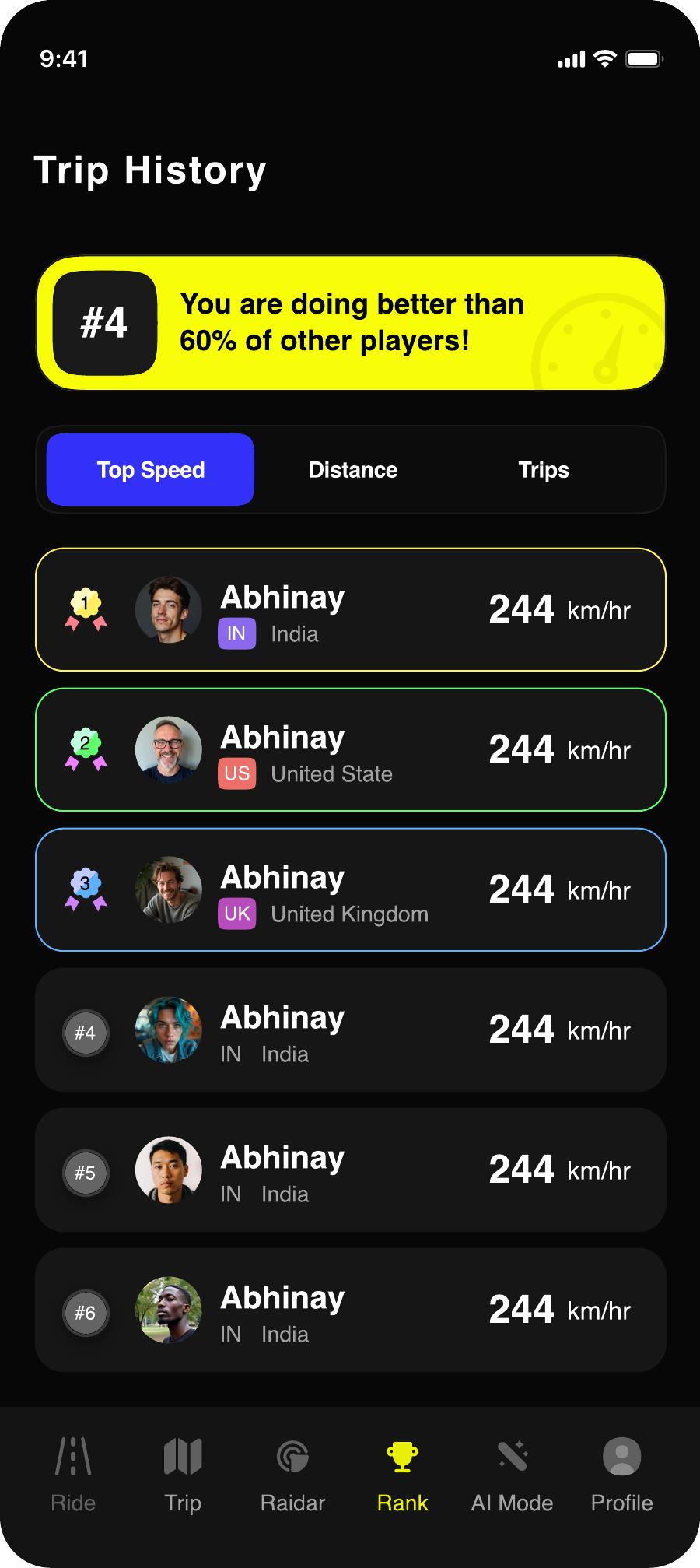
Where that trip moved you, and who is above
- 08
Premium
Offered after value, annual anchored against monthly
Chapter 07
The design system
Palette, type and components
Palette
Void Black #0B0B0F
Canvas. Zero glare at night, zero battery on OLED.
Electric Blue #2F2FEF
Primary action, dial arc, active nav.
Volt Yellow #F2F227
Alerts and records only — never decoration.
Panel #1A1A20
Cards, tiles and input fields.
Mist #9A9AA5
Labels, secondary metrics, disabled states.
Paper #F5F5F7
Primary readouts and headings.
Type scale
Component kit — 24 parts
Chapter 08
The shipped app
15 screens, tap any to expand
01Splash
Brand mark on true black. Permissions and location warm up behind the 800ms hold.
02Onboarding — Tracking
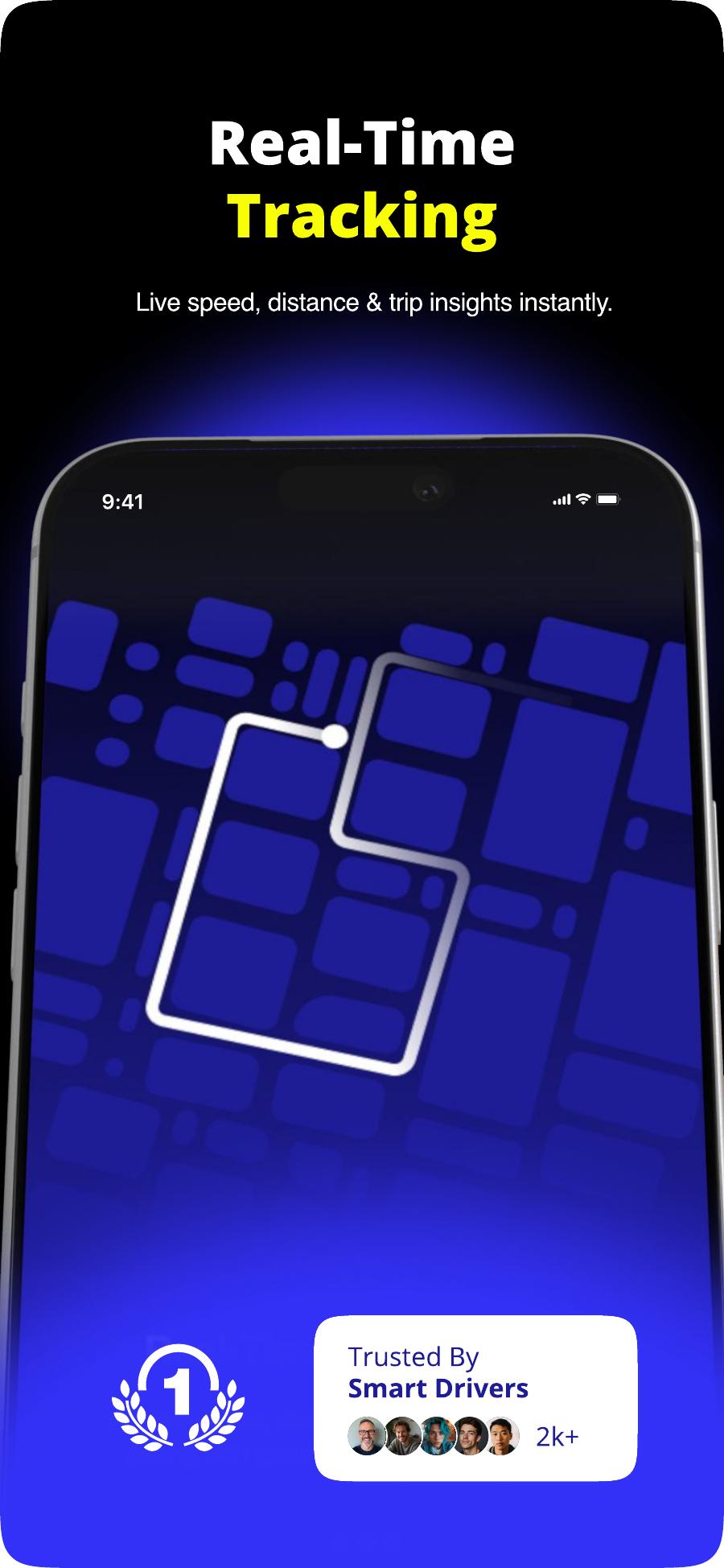
Value first card: live speed, distance and duration. Next and Skip both present.
03Onboarding — Score
Frames the product as improvement, not surveillance. Score is the promise.
04Onboarding — Get Started
Third beat closes with the primary CTA. No account wall, no email.
05Set Up Profile
Avatar, username, country grid. Country is required — it powers the flag on the leaderboard.
06Home — Idle HUD
The dial at rest, six stat tiles at zero, free-trip counter and one blue Start Tracking.
07Notification Priming
System prompt requested only at the moment radar alerts become useful.
08Recording
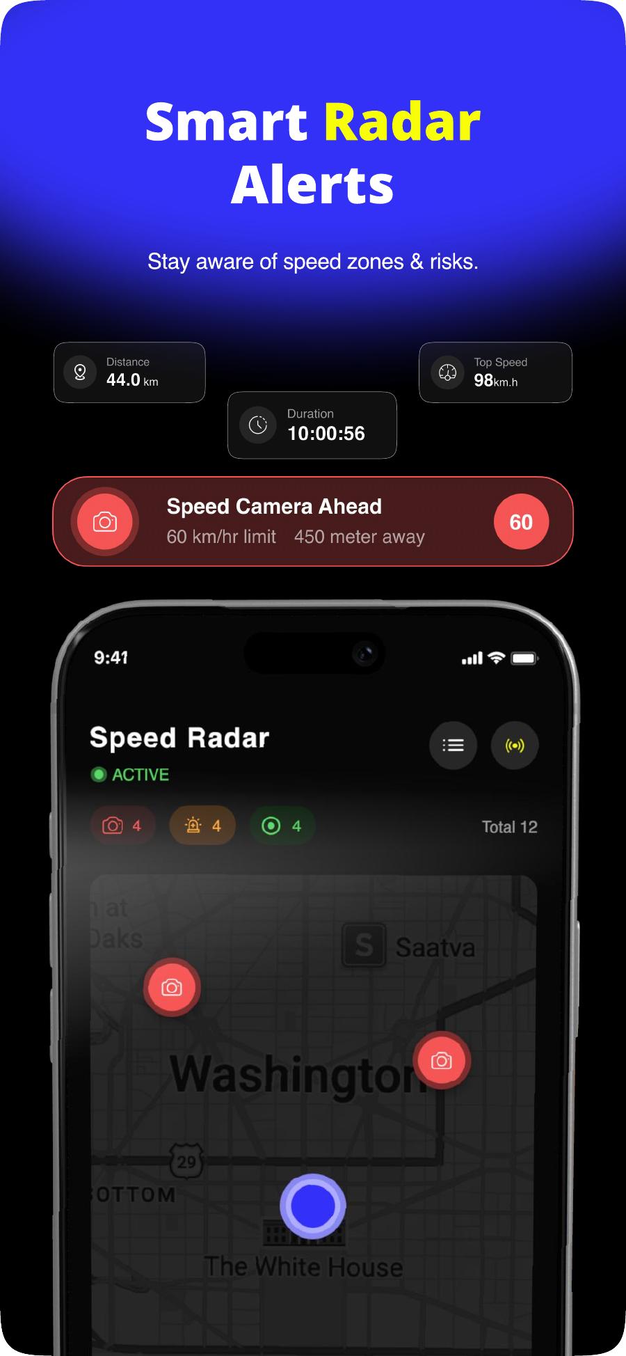
Live state: recording chip, timer, and a volt-yellow speed-camera warning with distance.
09Trip History
Segmented All / Today / This Week, route chips, and a rollup card of lifetime stats.
10Trip Complete
Top speed as the hero moment, then stats, Share Trip and Copy Stats.
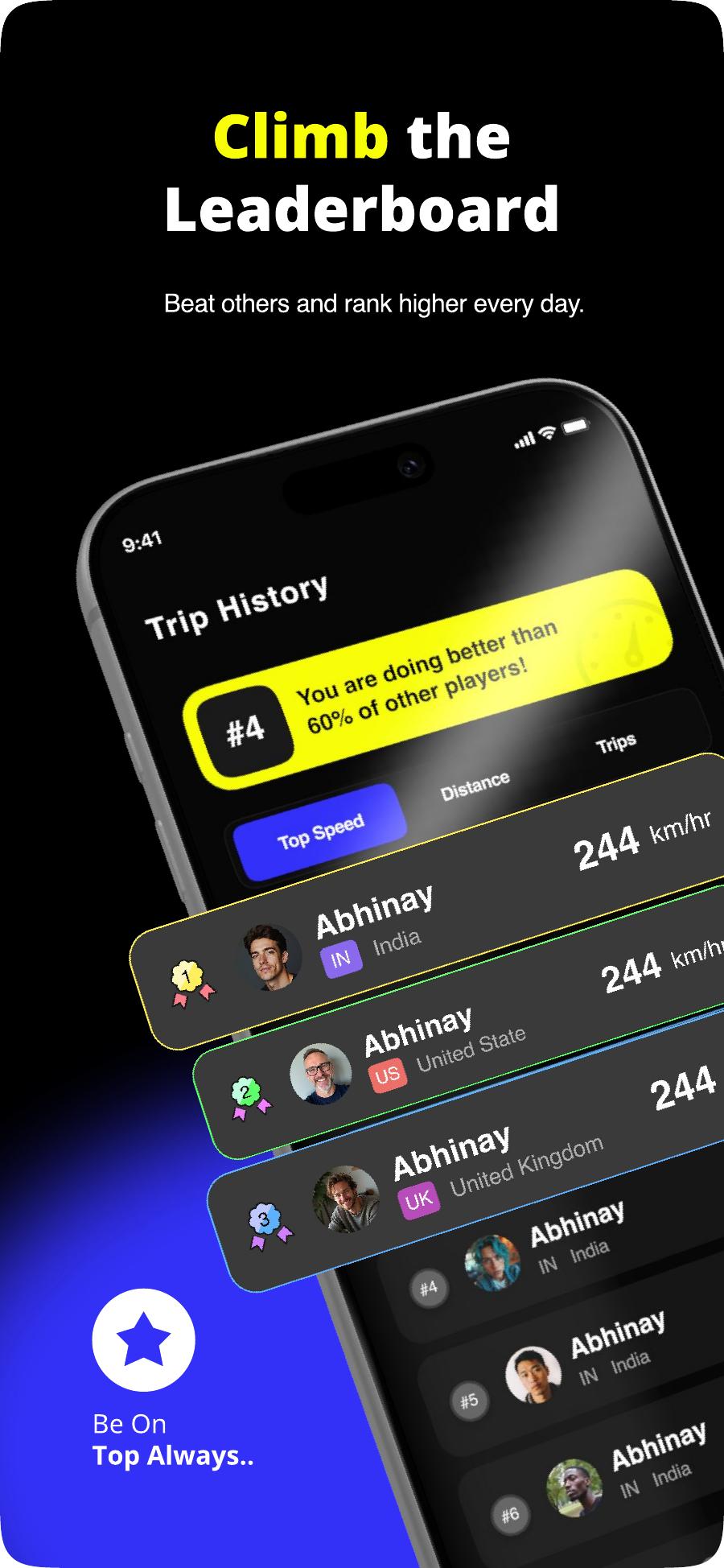
11Leaderboard
Your rank pinned with a social proof line, then the global board with flags.
12Speed Radar
Active zone counts on a live map with a manual refresh for low-signal areas.
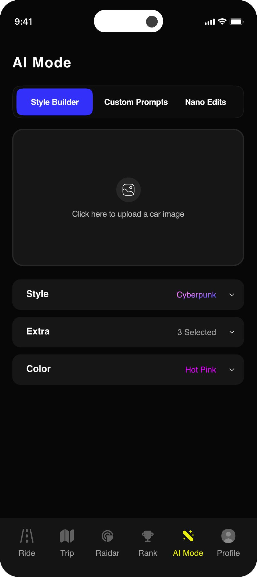
13AI Mode
Style Builder, Custom Prompts and Nano Edits — car renders as the retention hook.
14Settings
Stats header, units, auto-start, subscription and the whole about block in one scroll.
15Premium
Annual recommended and price-per-week anchored; free trial keeps the exit soft.
Chapter 09
Craft decisions
The details that carry the product
The 4.2 second dial
Numerals are set in Archivo Black at 96pt with tabular figures so digits never shift width while the speed climbs. Legible in a 0.4s glance from a phone mount.
Alerts borrow the road
Speed-camera warnings use the volt yellow and circular limit sign drivers already read on signage. No new visual language to learn at speed.
Stats in pairs, always six
Avg / Top, Distance / Altitude, Duration / Stopped. A fixed 2×3 grid means muscle memory finds a number without reading labels.
Rank before you ask
The leaderboard header says “you are doing better than 60% of other players” before showing position — motivation ahead of judgement.
Paywall as a comparison
Annual is recommended and broken to ₹57.67/week against monthly's ₹115.67 — the maths does the argument, not the copy.
Chapter 10
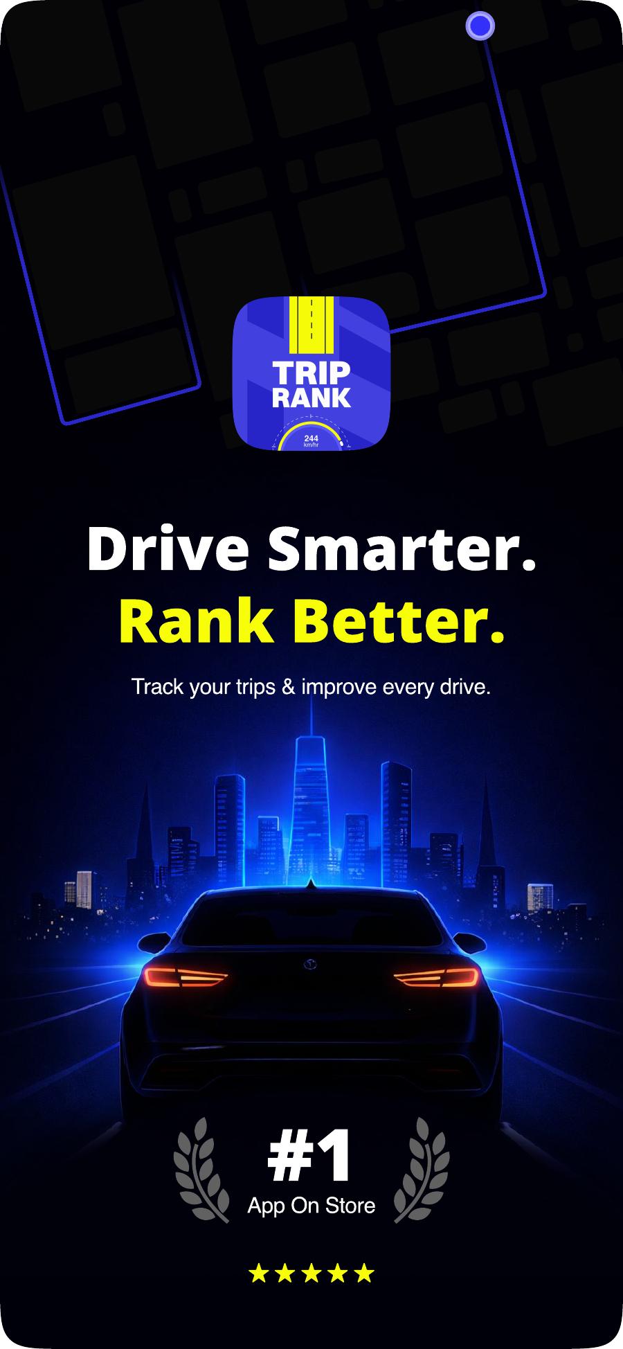
App Store creatives
Five frames that sell the loop
Chapter 11
Outcomes
What changed after ship
3.1×
D7 retention
vs the tracking-only benchmark build
2 taps
to first trip
down from 6 in the previous flow
+41%
trial starts
after moving the paywall behind 3 free trips
4.8
store rating
first 60 days, majority citing readability
Chapter 12
Handoff & next
Shipping the system, not the screens
Tokens first
Colour, radius, spacing and type shipped as named tokens so the build never guesses a hex.
Motion spec
Dial easing, radar alert entry and trip-complete reveal documented as duration + curve pairs.
Roadmap
Crew leaderboards, route replays and an offline-first trip queue are the next three sprints.