
Building a joyful Indian snacking brand through storytelling, illustration, packaging and a playful mascot.
Overview
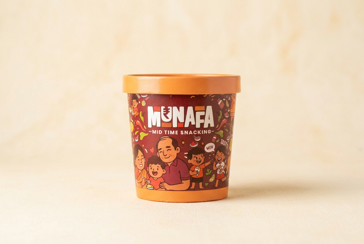
MUNAFA is a modern Indian snack brand created around one simple idea: every snack should feel like a happy little break.
Instead of selling only a product, MUNAFA creates an emotional experience inspired by childhood memories, family moments, school tiffins and evening conversations.
The objective was to design a complete visual identity system that could scale across packaging, retail, digital media and merchandise while remaining instantly recognizable.
Client
Munafa Foods LLP
Industry
FMCG · Packaged snacks
Role
Brand identity & packaging
Year
2026
Deliverables
- Brand Identity
- Packaging Design
- Illustration System
- Mascot
- Social Media
- Retail Branding
- Brand Guidelines
The Challenge
Every snack shelf today looks the same, and customers decide in under five seconds.
Bright colors
Every shelf screams at the same volume.
Random graphics
Decoration without a system behind it.
Large product shots
Photography replaces personality.
Heavy typography
Loud type, no voice.
The challenge: design a brand that feels friendly, memorable, emotional, premium and fun — without looking childish.
Design Goal
We wanted people to remember the brand before remembering the flavour.
- ✓Look different from competitors
- ✓Create shelf impact
- ✓Build emotional attachment
- ✓Be scalable
- ✓Work on every packaging size
- ✓Become a recognizable FMCG identity
Research
Market analysis across ten Indian and global snack brands.
- Bingo
- Too Yumm
- Balaji
- Haldiram
- Kurkure
- Lay's
- Doritos
- Paper Boat
- Chumbak
- Amul
Finding 01
Most snack brands lean entirely on product photography.
Finding 02
Very few build an emotional illustration language.
Finding 03
Almost none create a full mascot ecosystem.
Opportunity: build India's happiest snack brand.
Brand Strategy
Brand position
A joyful Indian snack brand built around togetherness.
Not just food. An experience.
Brand values
Audience
Primary
- 8–18 years
- School kids
- Teenagers
Secondary
- 18–35
- Students
- Office workers
- Young adults
Family buyers
- Parents
- Families
- Retail customers
Brand Personality
Visual Direction
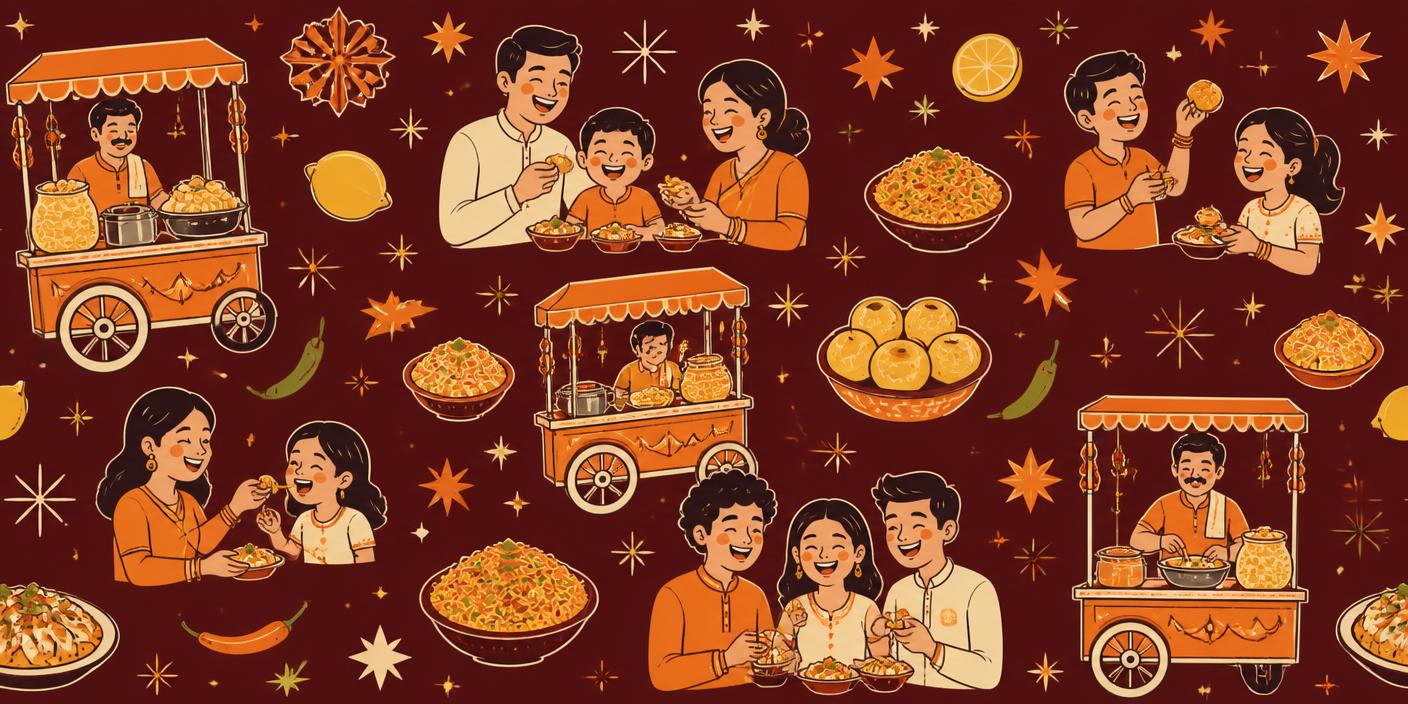
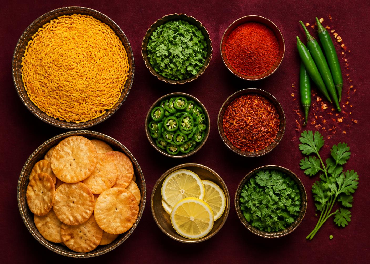
Moodboard: where the illustration language came from.
- Street food
- Indian festivals
- School breaks
- Tea time
- Family gatherings
- Hand drawn doodles
- Warm textures
- Paper packaging
- Friendly characters
Theme Colors
One warm base, two energy colours, and an accent set that codes flavour.
Primary palette
Deep Tamarind Brown
#4A1F1C
Masala Orange
#F58220
Crunch Yellow
#FFC63B
Cream White
#FFF7EE
Fresh Green
#4CAF50
Chilli Red
#D8432E
Dark Coffee
#2D1714
Accent colors — flavour differentiation
Typography
Heading
Titan One
Wordmark-matched: chunky rounded caps
Subheading
Fredoka
Section labels, product names
Body
Poppins
Alt: Manrope, Nunito
- Rounded
- Friendly
- Bold
- Readable
Logo Breakdown
Meaning
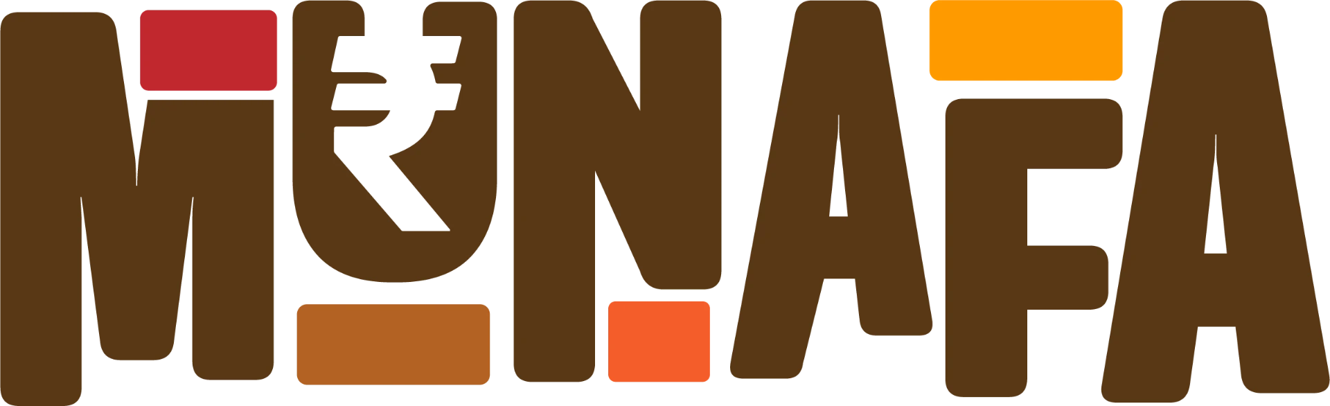
Munafa = profit, but here it means the small daily profit of a happy break. The ₹ hides inside the U.
Construction grid
Drawn on an 8-unit baseline grid; cap height 5u, counters 2u.
Spacing
Clear space equals the height of the letter M on all four sides.
Minimum size
18mm wide in print, 96px on screen. Below that, use the M mark.
Wrong usage
No stretching, no outline, no gradient fill, no drop shadow, no rotation.
Safe area
Never place over busy illustration — always on a solid brown, cream or orange field.
Monochrome
One-colour cream on brown for cartons, one-colour brown on kraft for shippers.
Illustration Language
Instead of random graphics, we built a complete illustration ecosystem.
Characters
- Kids
- Parents
- Friends
- Grandparents
- Street food moments
- Office breaks
- Celebrations
Supporting doodles
- Stars
- Sparkles
- Leaves
- Chillies
- Corn
- Peanuts
- Lemon
- Spices
- Speech bubbles
Shape System
These shapes repeat consistently across every touchpoint.
Rounded blobs
Organic waves
Speech bubbles
Sticker shapes
Burst badges
Curved dividers
Ribbon tags
Flavor labels
Iconography
Minimal rounded style, single weight, drawn on the same 8-unit grid as the logo.
- Ingredient icons
- Veg symbol
- QR icons
- Reward icons
- Games
- Recipes
- Offers
- Delivery
Packaging System
Every pack reads top to bottom in three fixed zones.
Top
Logo lockup + Mid Time Snacking rule
Middle
Flavour name + illustration scene
Bottom
Ingredients, QR, weight, veg mark, icons
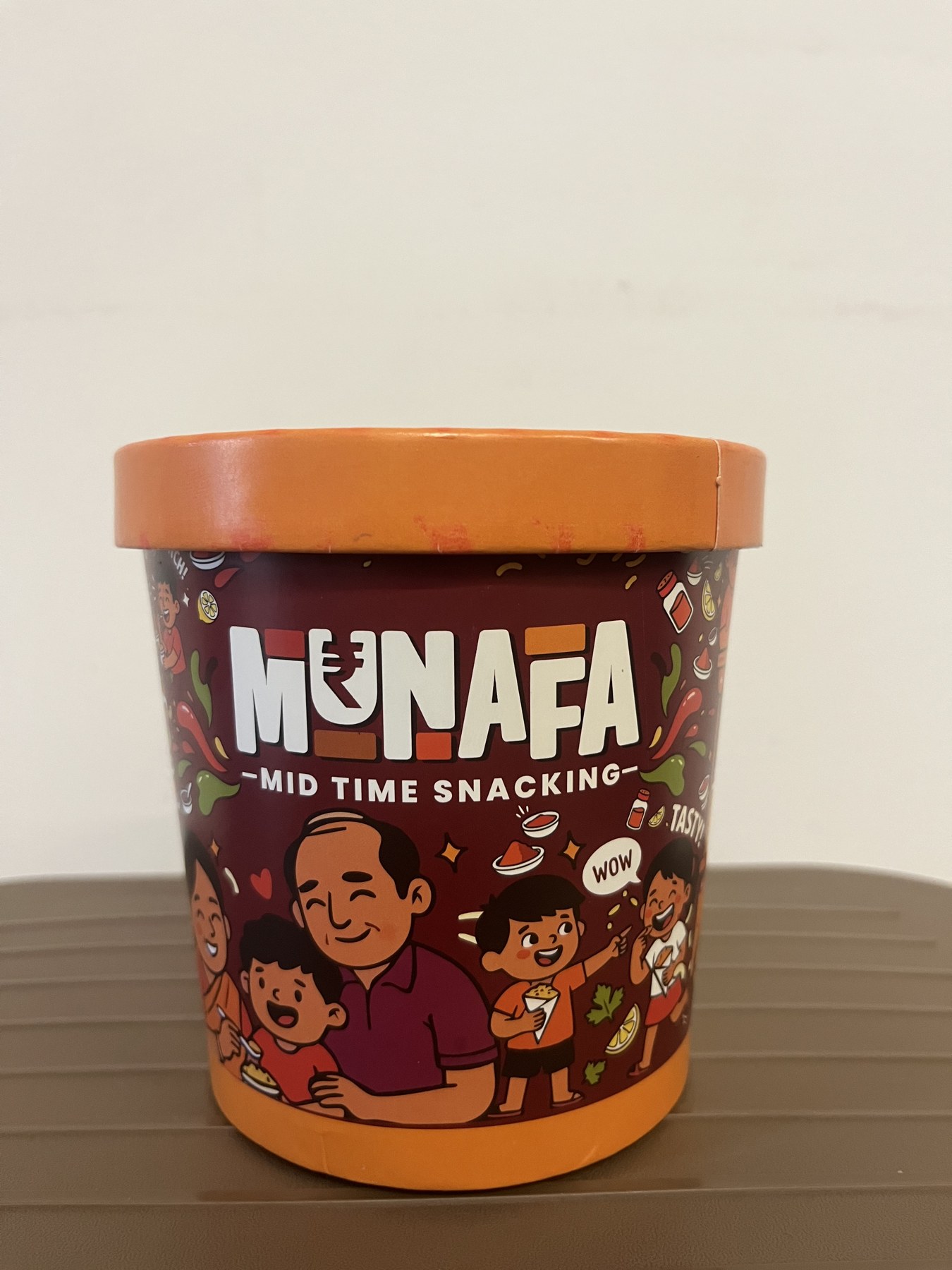
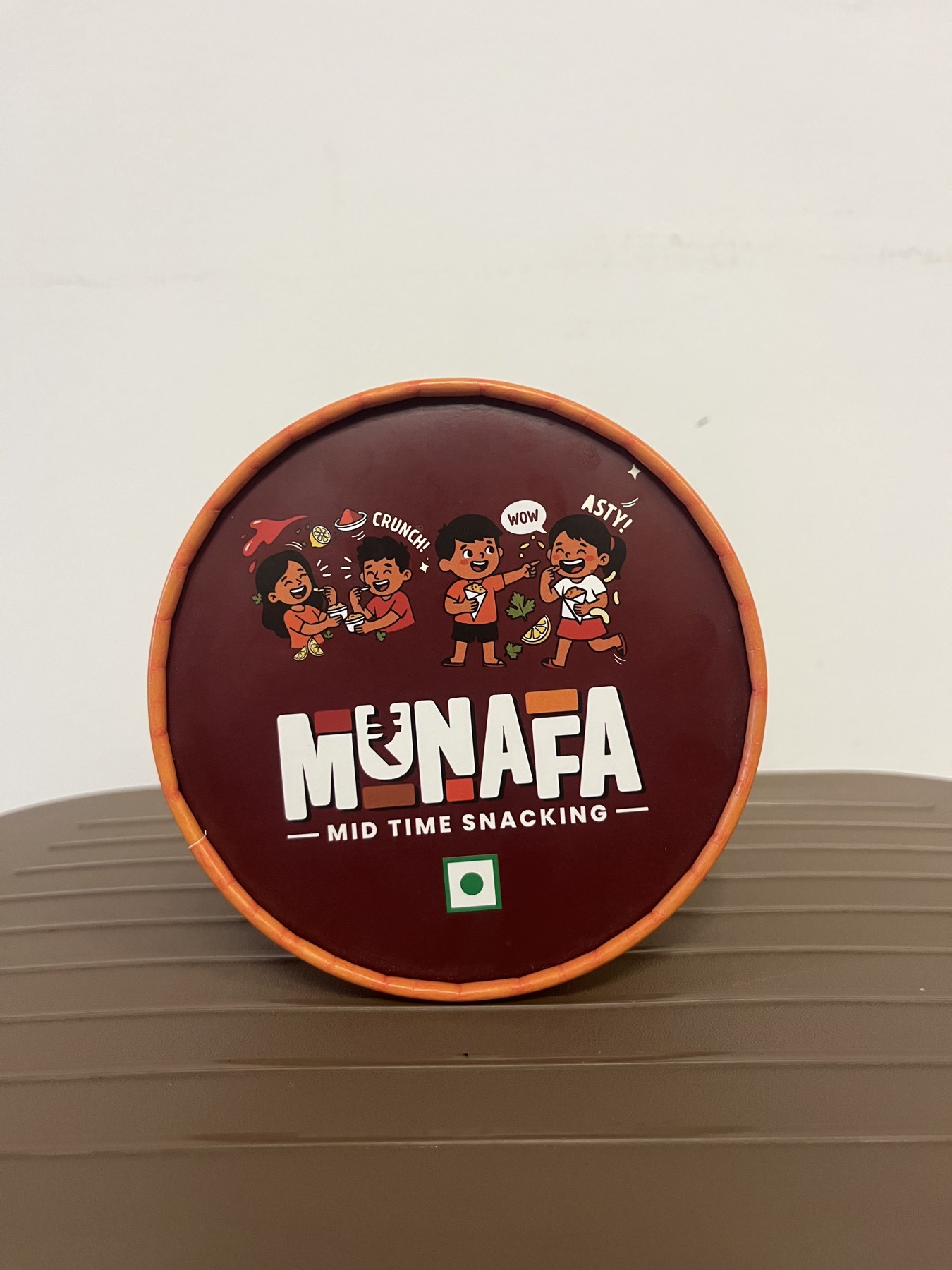
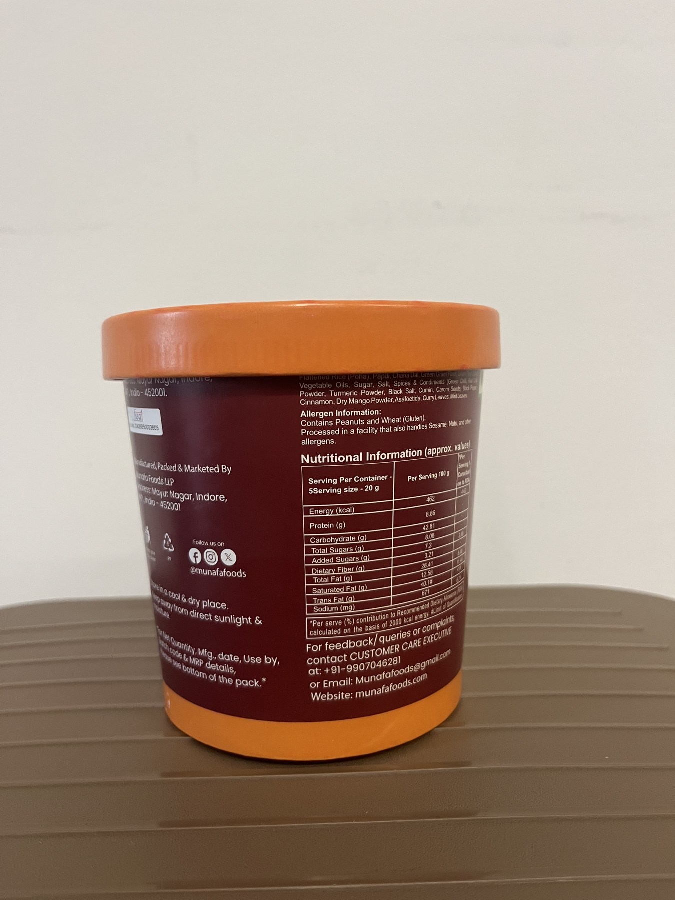
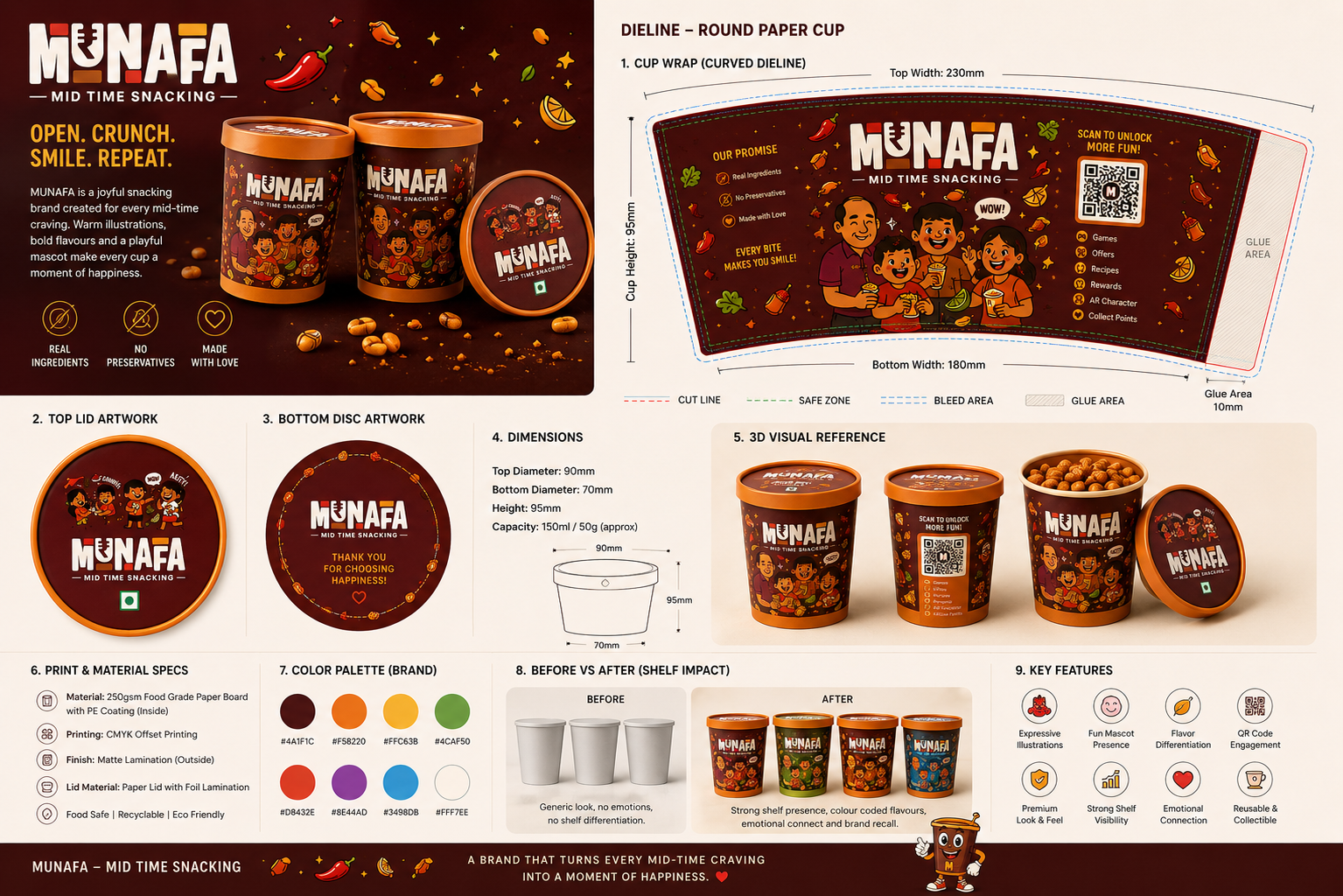
Flavor System
One color = one flavor. The rule never bends.
Classic Masala
#4A1F1C
Pudina Punch
#4CAF50
Cheesy Corn
#FFC63B
Chatpata Twist
#D8432E
Mexican Jalapeno
#8E44AD
Cream & Onion
#3498DB
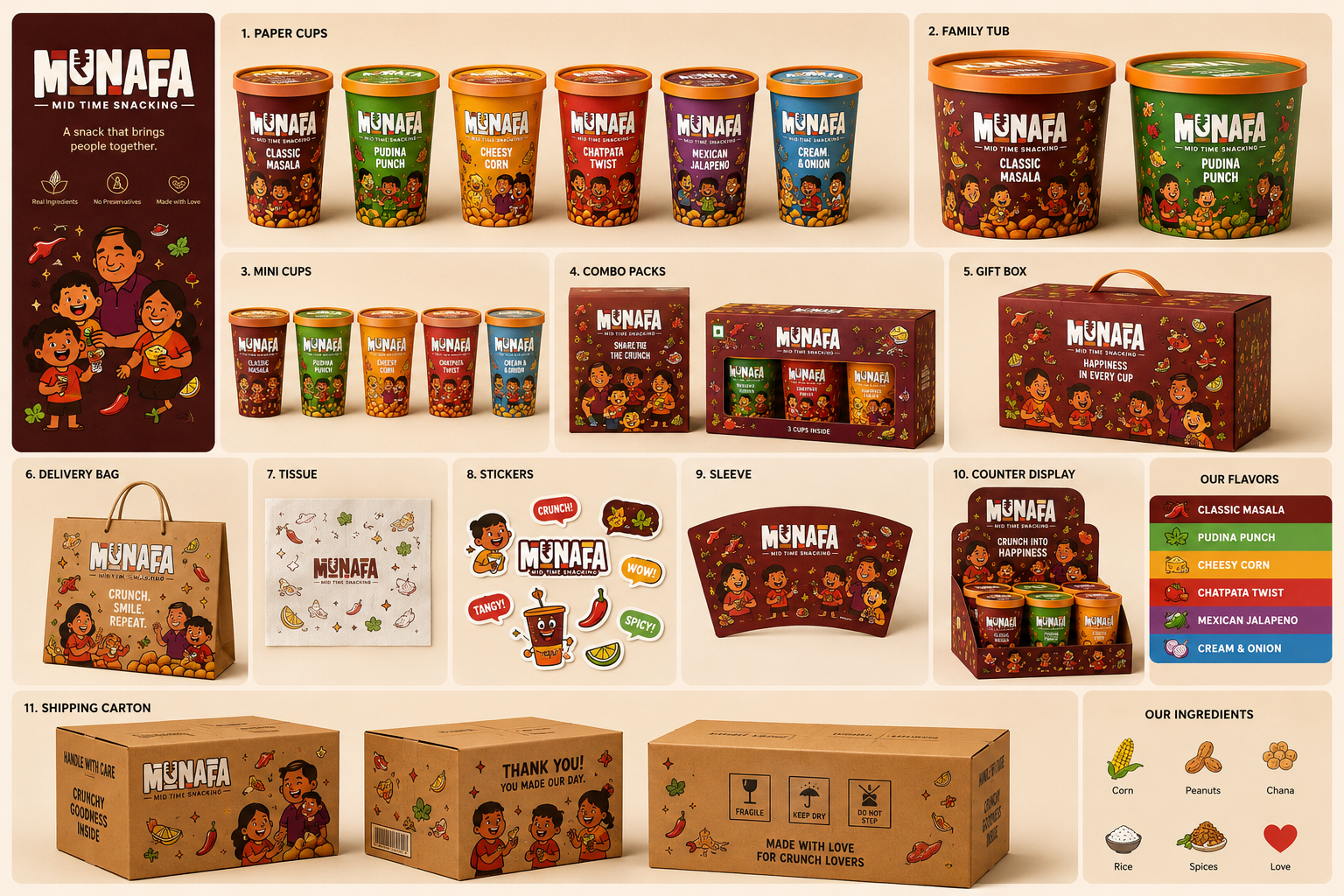
Packaging Extensions
- Paper cup
- Mini cup
- Family tub
- Combo box
- Gift box
- Delivery bag
- Sleeve
- Sticker
- Counter display
- Shipping carton
- Retail standee
Paper cup
60g hero format with peel lid.
Sweets box
Festive mithai in the same brown.
Mini pouch
20g single-serve for tiffins.
Gift tin
Reusable Diwali collectible.
Family jar
400g pantry refill.
Sub-brand — Munafa Sweets
Besan Laddoo
Kaju Katli
Chocolate Barfi
Rose Peda
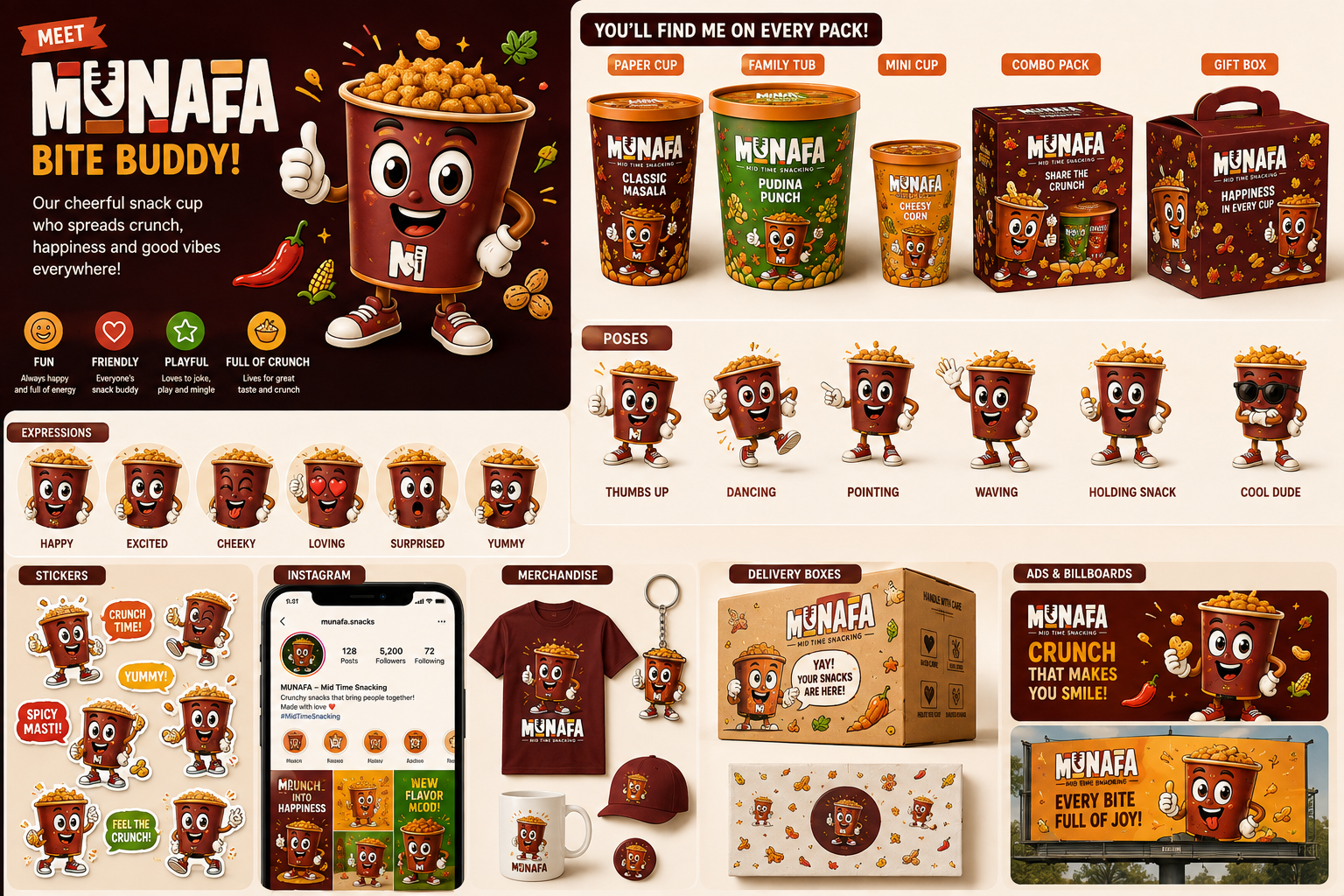
Meet Bite Buddy
Mission: to spread happiness. One mascot, many expressions, unlimited connections.
Expressions
- Happy
- Surprised
- Hungry
- Excited
- Cool
- Dancing
- Thumbs up
- Eating
- Running
Appears on
- Packaging
- Ads
- Delivery
- Merchandise
- Retail
- Animations
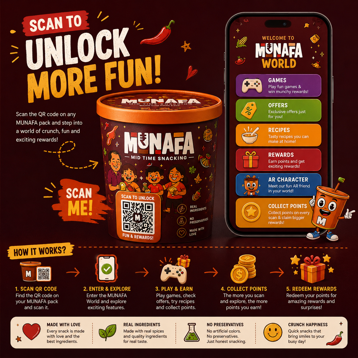
QR Experience
Scan the QR on any pack and the packaging becomes a digital engagement platform.
- Mini games
- Offers
- Recipes
- Loyalty rewards
- AR character
- Collect points
- Referral program
- Spin wheel
- Daily rewards
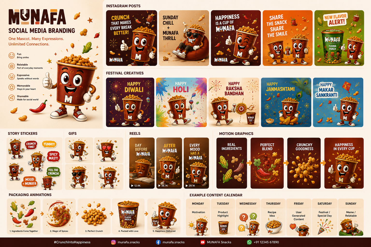
Social Media System
- Stories
- Reels
- GIFs
- Motion graphics
- Festival posts
- Memes
- Product launches
- Mascot comics
- Packaging animation
Merchandise
T-shirts
Caps
Bottles
Mugs
Keychains
Badges
Stickers
Notebook
Lunch box
Tote bag
Retail Experience
Shelf display
Counter display
Danglers
Wobblers
Floor graphics
POP stand
Kiosk
Sampling booth
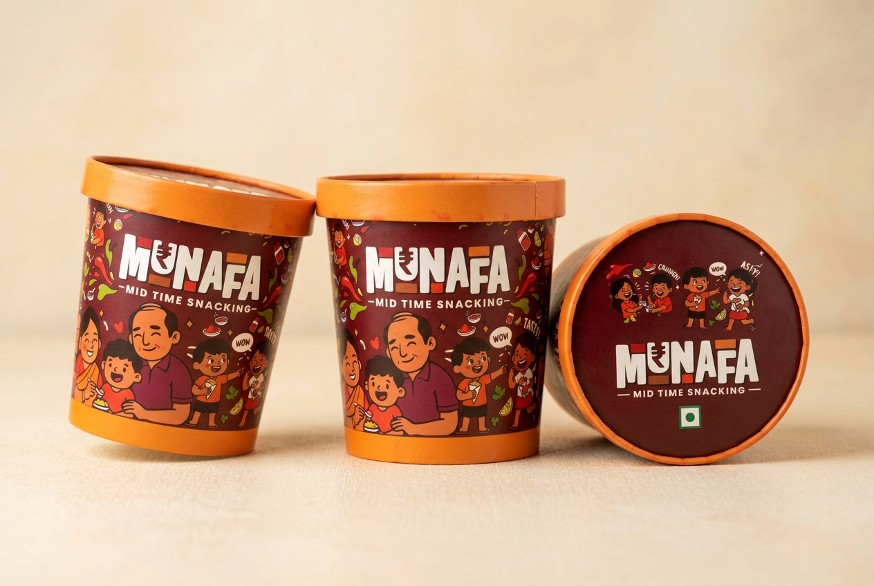
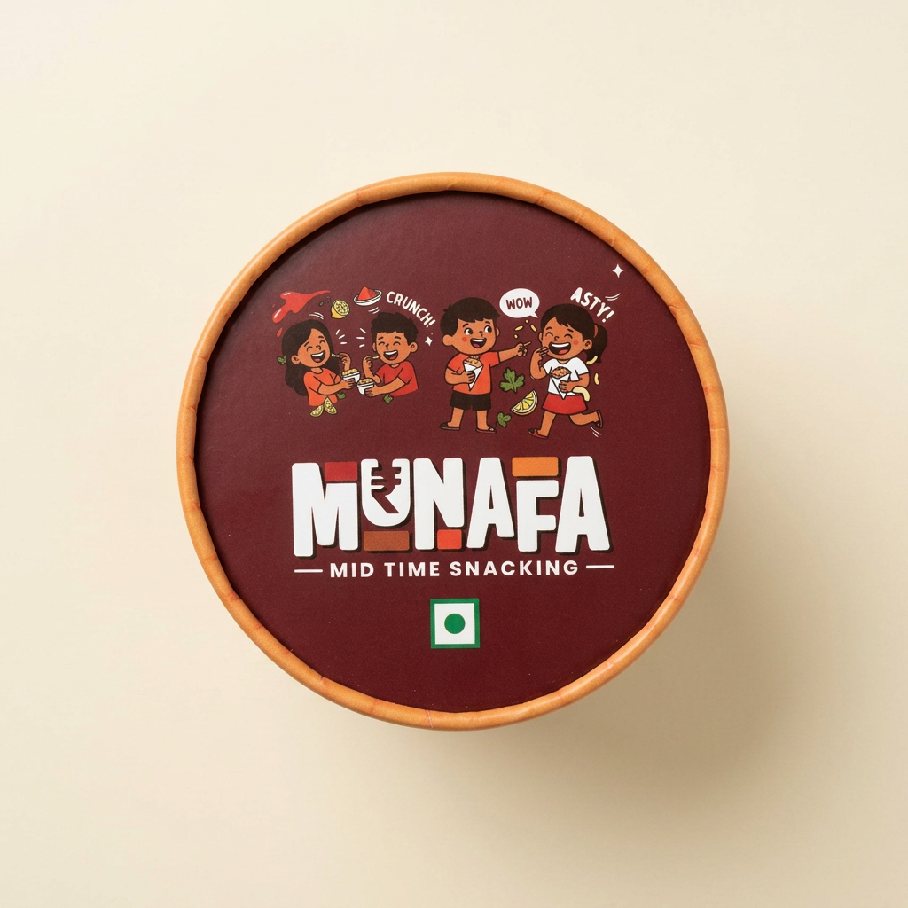
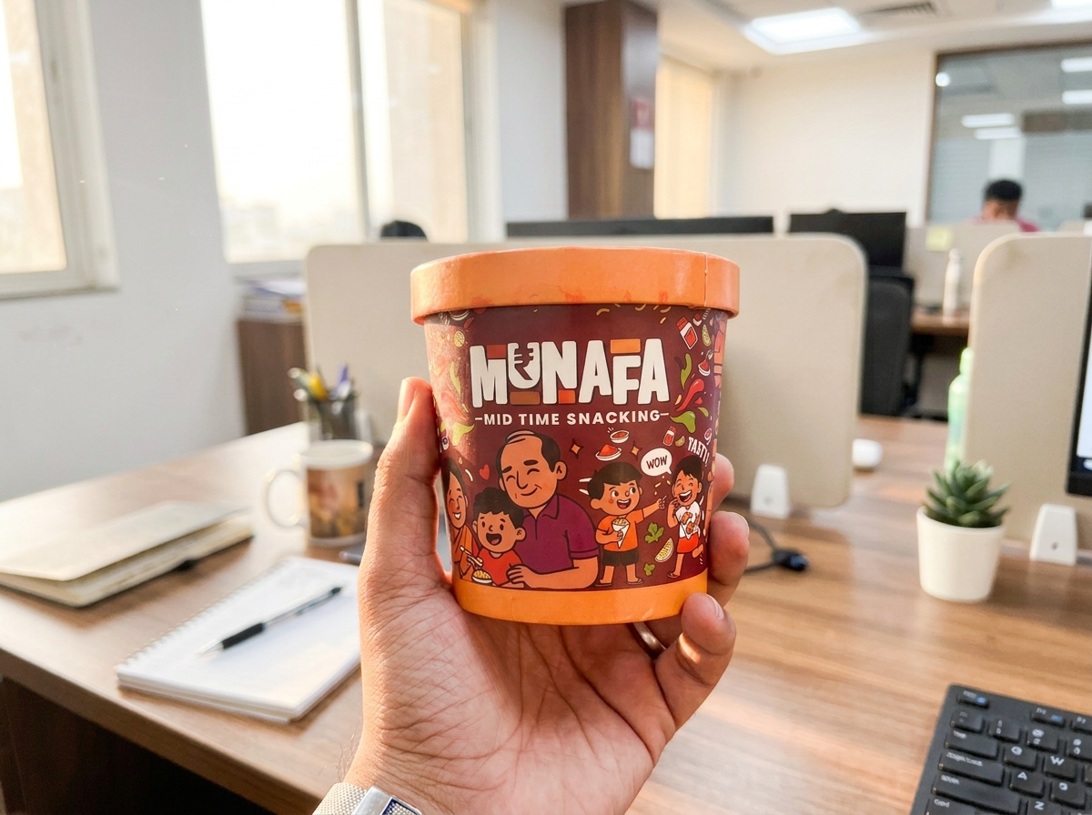
Packaging Mockups
Premium renders across seven set-ups.
- Top view
- Lifestyle
- Shelf
- Flat lay
- Retail
- Hands holding product
- Open lid
Brand Guidelines
Eleven chapters, one source of truth for every future pack.
- 01Logo usage
- 02Colors
- 03Typography
- 04Illustrations
- 05Mascot
- 06Patterns
- 07Icons
- 08Photography
- 09Packaging rules
- 10Social templates
- 11Motion principles
Brand Tone
- Friendly
- Playful
- Positive
- Conversational
- Indian
- Emotion first
- Never corporate
“Khao, muskurao, munafa kamao.”
“Wow. Tasty. Crunch.”
“Mood = Munafa.”
“Happiness in every cup.”
Future Vision
Loyalty app
AR filters
Kids games
Collectible stickers
Limited edition mascots
Festival packaging
Regional flavours
Comic series
Design Impact
- •Strong shelf visibility
- •Consistent brand recognition
- •Better product differentiation
- •Higher emotional connection
- •Scalable packaging architecture
- •Unified digital and retail presence
- •Memorable mascot-driven storytelling
More than a snack. It's a happy brand experience.