1 Lakh.
One Mission.
Designing a movement that transforms menstrual hygiene into a public conversation.
Turning silence into a city-wide conversation.
Menstrual hygiene is still surrounded by silence and stigma in many communities. The objective was to create a campaign that could educate, inspire participation, and mobilise support for distributing one lakh sanitary pads across Indore.
Role
6 weeks
Duration, from strategy to distribution day.
1,00,000
Sanitary pads targeted across one city.
Millions of girls miss opportunities because access to menstrual hygiene is still limited.
1 in 4
Girls miss school days during their period.
64%
Still rely on unsafe alternatives to pads.
71%
Learn about menstruation only after menarche.
0
Public conversations most families ever have.
1 LAKH
SANITARY PADS
ONE CITY
ONE PURPOSE
How do you discuss menstruation without making the campaign uncomfortable?
How do you inspire action instead of sympathy?
How do you make social awareness shareable?
Lock-up
1 LAKH
ONE MISSION
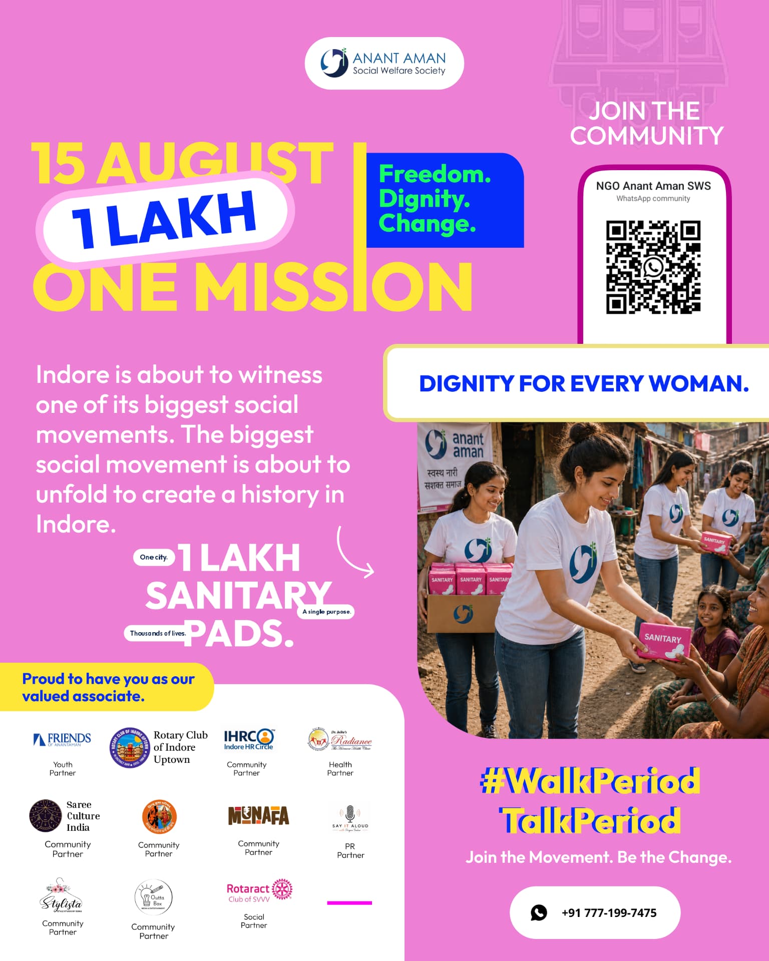
A number-first lock-up: the goal is the logo. Rounded pill holds the count, the vertical rule splits date from promise.
Buttons
Hashtags
#WalkPeriodTalkPeriod
#DignityForEveryWoman
QR card
Cards & icons
Campaign Pink
#E67AC9
Warmth and femininity without infantilising. It carries the emotion of the campaign.
Freedom Blue
#1E40FF
Independence Day energy and trust. Used for every action the viewer must take.
Hope Yellow
#FFD63D
Optimism. Highlights, never backgrounds for long copy.
White
#FFFFFF
Breathing room. Containers, partner strips, and legibility at street distance.
Dark Grey #222222 — body copy, captions, and all long-form reading.
Display — Clash Display / Satoshi Bold
Dignity for every woman.
One city. A single purpose.
Body — Inter
Body copy is set in Inter at 16–18px with 1.7 line height. Long paragraphs never exceed 60 characters per line so posters stay readable from two metres away.
H1
72 / 0.95 / -3%
H2
48 / 1.0 / -2%
H3
28 / 1.1
Body
17 / 1.7
Caption
13 / 1.5
Eyebrow
12 / 0.24em caps
Rounded pills
Curved arrows
Speech bubbles
Yellow highlight bars
Blue information cards
QR cards
White rounded containers
Hashtags
CTA buttons
Partner strips
Teaser
Awareness
Education
Problem
Stories
Community
Partners
Distribution Day
Impact
Awareness
- — 15 August
- — 1 Lakh
- — One Mission
Educational
- — Why pads matter
- — Health
- — Hygiene
- — Myths
Community
- — Partner posts
- — Volunteer stories
- — QR
Countdown
- — Day 7
- — Day 6
- — Day 5
Event
- — Distribution
- — Photos
- — Reels
Impact
- — Results
- — Testimonials
- — Thank you
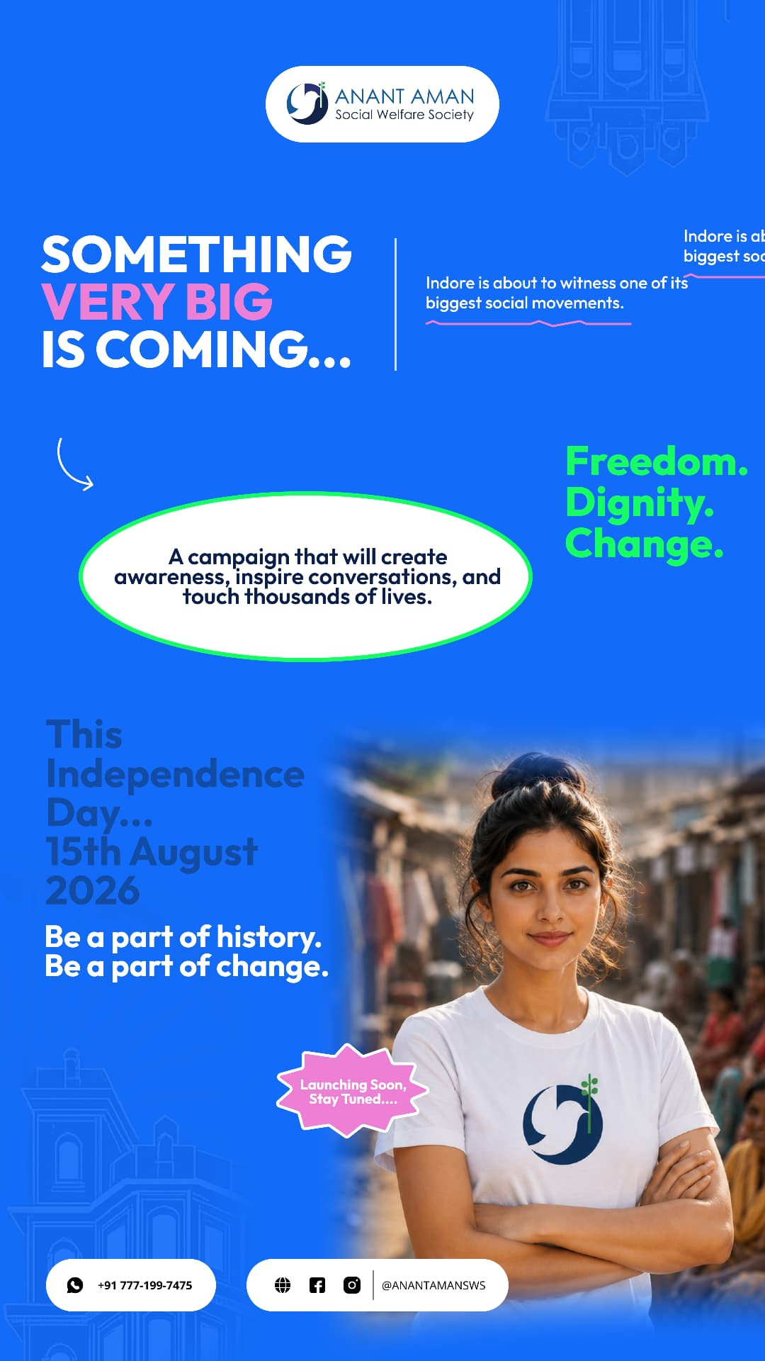
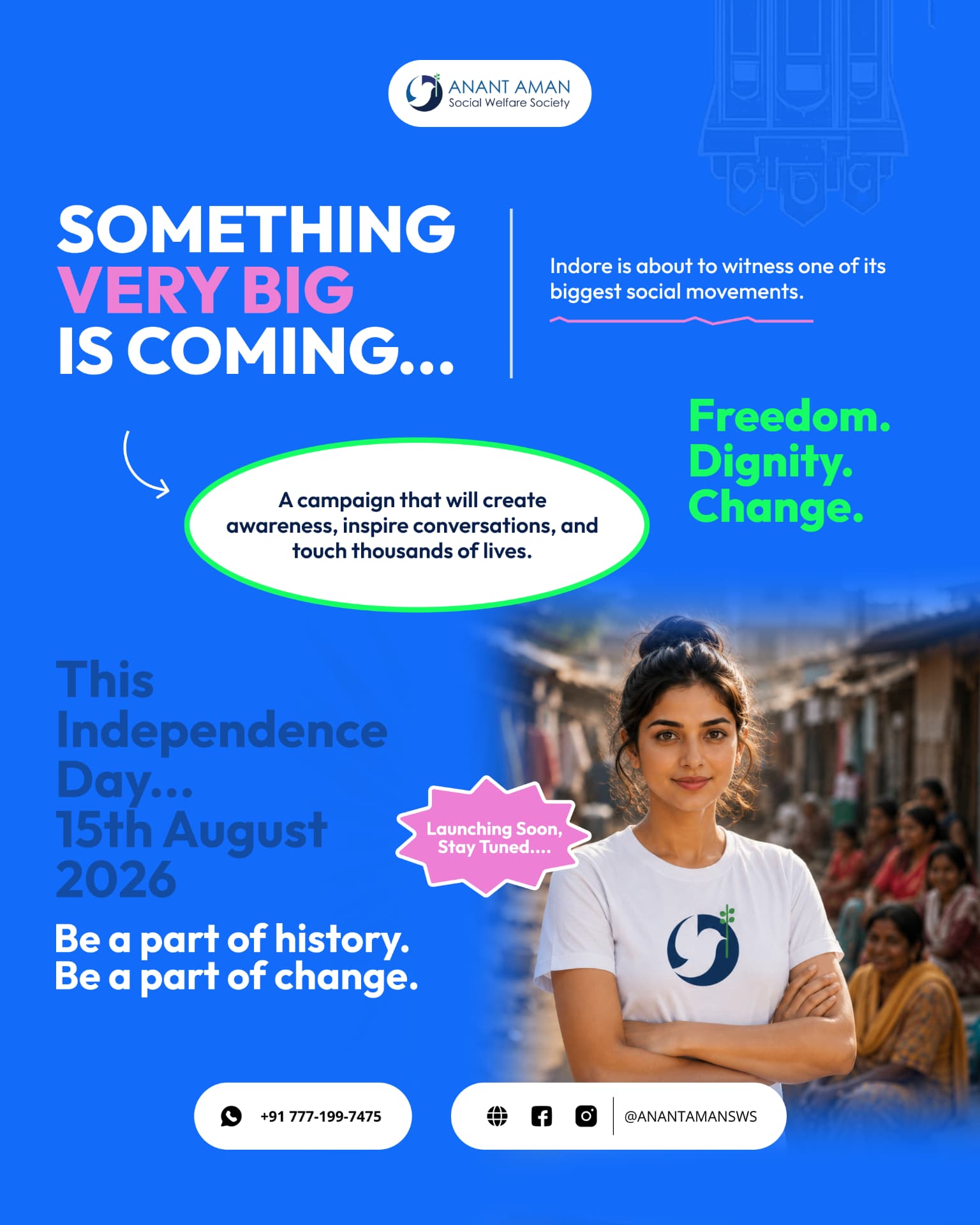
Something very big is coming…
Ten days before 15 August the city saw no numbers, no ask — only a promise. Electric blue field, pink emphasis on VERY BIG, green triad of Freedom. Dignity. Change. and a volunteer looking straight down the lens. Curiosity first, cause second.
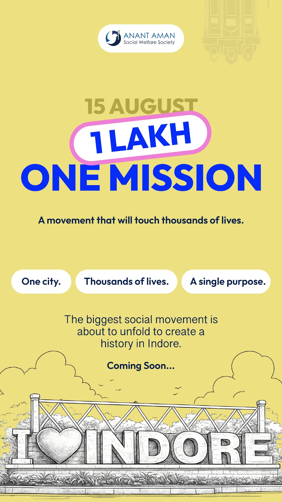
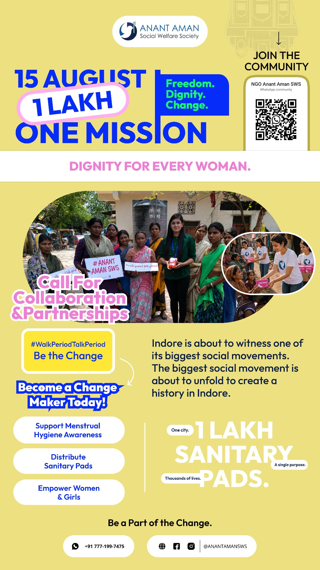
1 Lakh. One Mission.
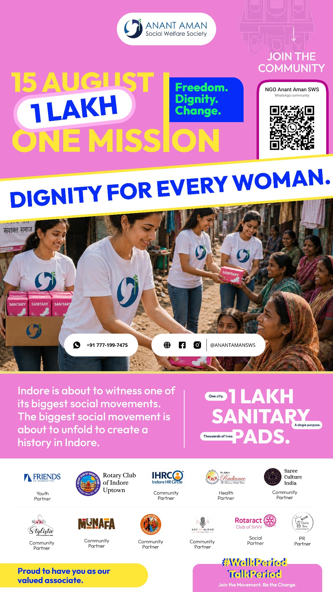
The number arrives on a warm yellow field so it feels like celebration, not appeal. The pill badge became the campaign's most portable asset — it survives on a poster, a story, a t-shirt and a 40 px avatar.
Line-art I ♥ INDORE anchors the mission to the city that owns it.
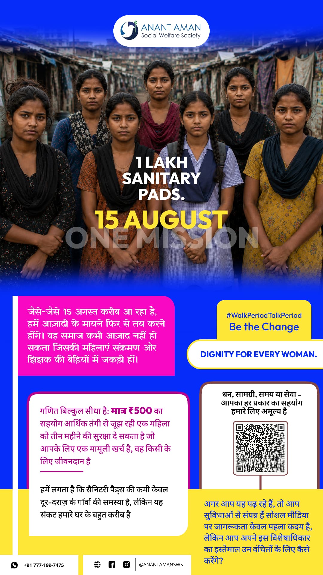
1 Lakh sanitary pads.
Phase three names the product out loud — the exact word most campaigns whisper. Campaign Pink fills the frame, a yellow-edged blue diagonal cuts the poster in half, and documentary photography carries the bottom third.
Say the word
“Sanitary pads.” set in the largest type on the sheet.
Diagonal cut
Dignity for every woman — a band, not a caption.
Real hands
Distribution photography instead of stock sympathy.
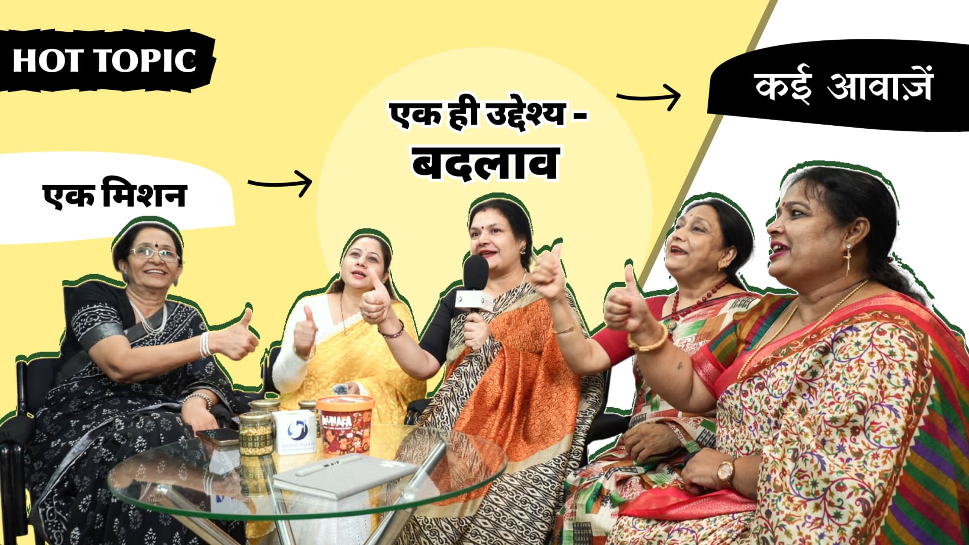
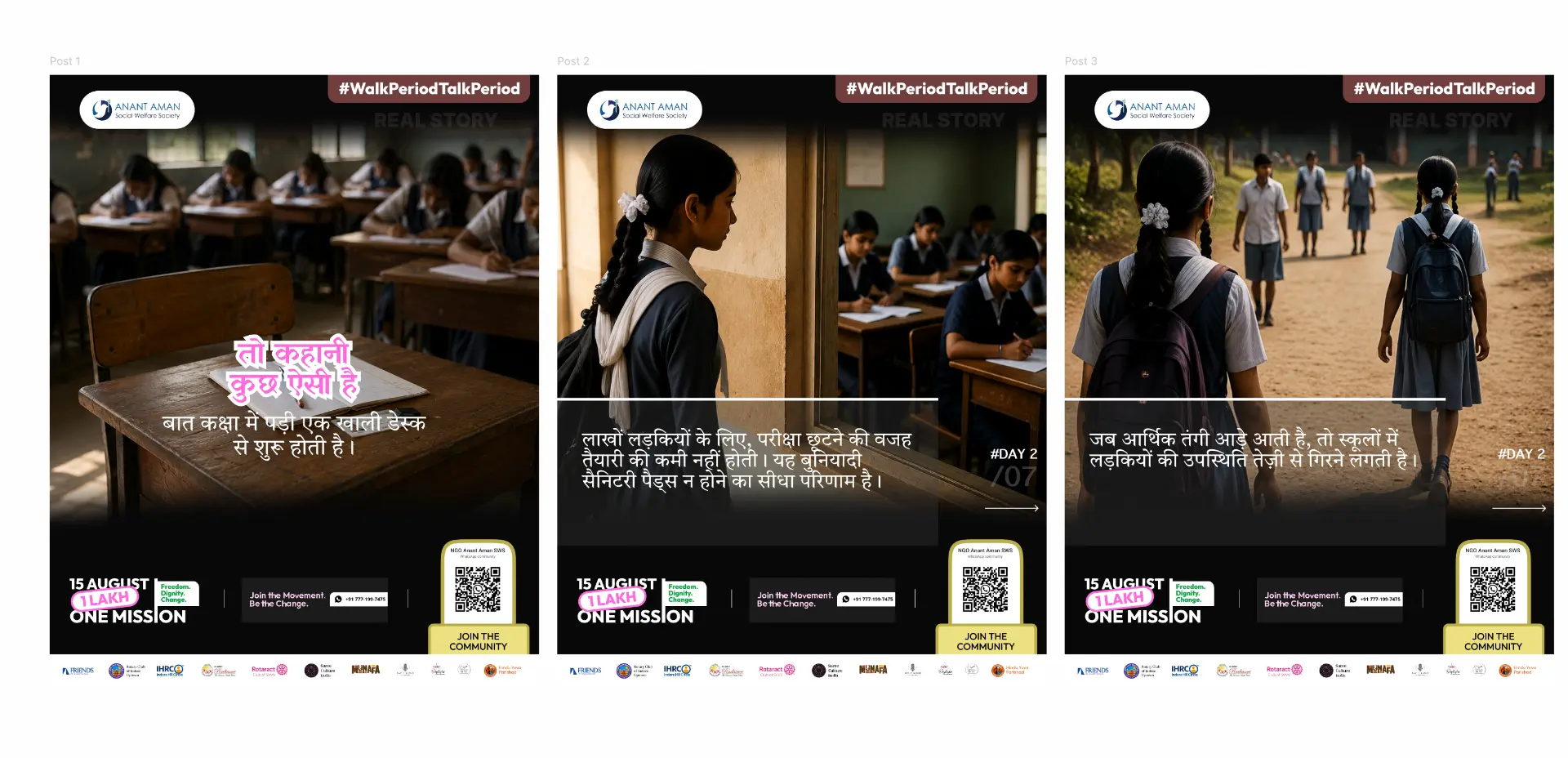
One empty desk. Three slides.
The narrative series drops the bright palette entirely and goes cinematic — Devanagari copy, a persistent footer lockup, the WhatsApp QR and the partner logo strip. Same skeleton on every slide, so the story moves and the brand stays still.
Hashtag rail
#WalkPeriodTalkPeriod locked top-right on every frame.
Hindi first
The audience reads Hindi; the campaign speaks Hindi.
Footer lockup
15 August · 1 Lakh · One Mission + WhatsApp CTA.
Partner strip
Twelve logos, one baseline, no hierarchy fights.
Headline
15 AUGUST / 1 LAKH / ONE MISSION set in display caps, three weights of emphasis.
CTA
WhatsApp community QR sits top-right, the highest-contrast object on the poster.
Hierarchy
Date → number → mission → proof → partners, top to bottom.
QR
Framed as a phone screen so people recognise the action instantly.
Photo
Real distribution photography, never stock — dignity over pity.
Partner logos
White strip at the base, equal sizing, single caption style.
Spacing
24px gutters, 48px block rhythm, generous white margins.
Grid
12 columns; the poster locks to 8 + 4.
Typography
Display for numbers, Inter for everything that must be read fast.
NGO Anant Aman SWS
WhatsApp community
Scan
Join WhatsApp community
Become volunteer
Donate
Register
Share campaign
Stage backdrop
Registration desk
Directional signage
Welcome standee
Media wall
Volunteer desk
Photo booth
One layout. Two temperatures.
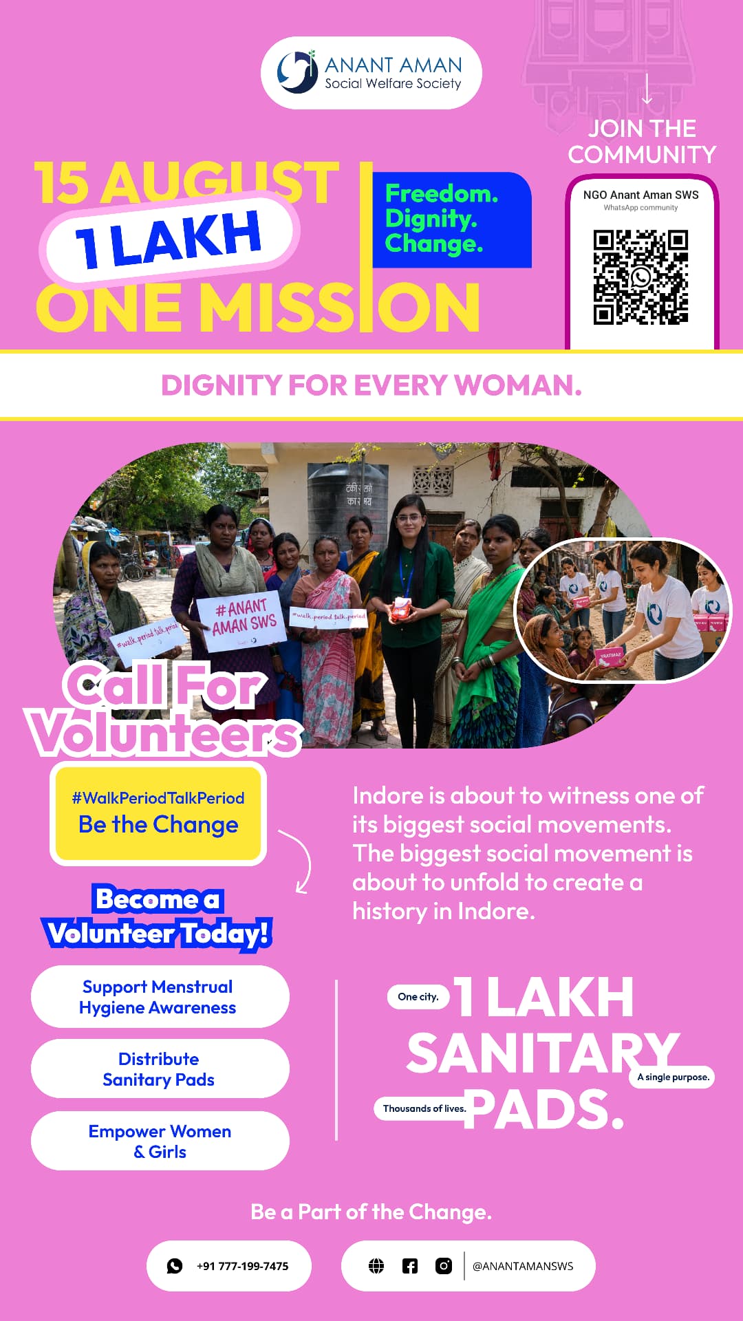
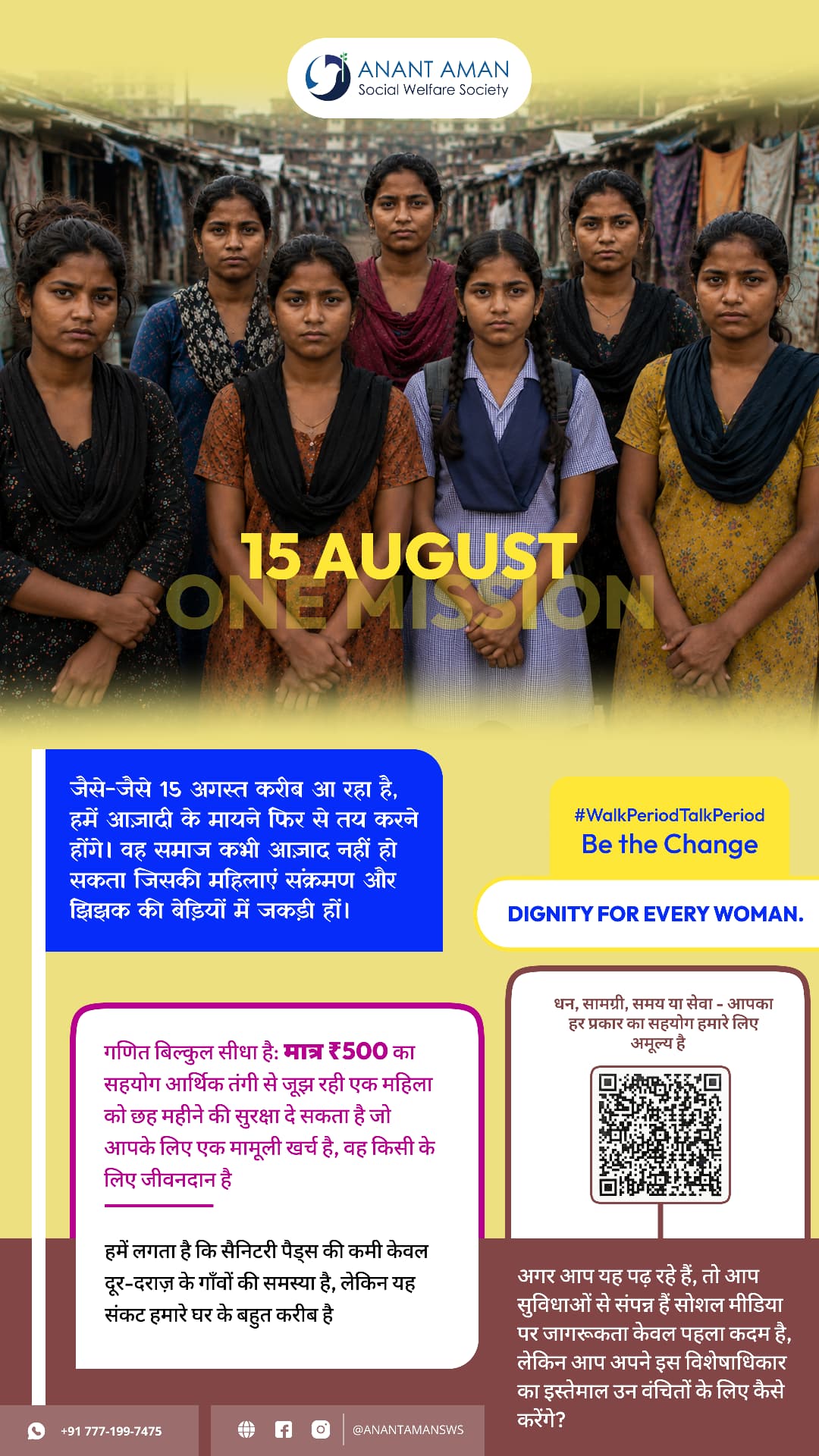
The closing poster was released in a Hope Yellow and a Freedom Blue cut. Identical grid, identical copy blocks, identical QR — only the field and accent swap. It let the same artwork sit beside twelve different partner brands without clashing.
Portrait band
Seven faces at eye level, 15 AUGUST burned into the crop.
Copy blocks
Hindi long-form in colour-blocked cards, never over photo.
₹500 maths
The donation logic gets its own card, not a footnote.
QR card
Bordered, framed, always bottom-right.
Typical NGO poster
Six typefaces, four logos, no focal point.
Sympathy photography, small unreadable CTA.
No repeatable system across formats.
This campaign
Designing awareness that people wanted to share.
1,00,000
pads. one city. one purpose.
Reflection
Great design doesn't just communicate a message — it helps people participate in it.
By creating a clear visual system, consistent storytelling, and accessible calls to action, the campaign turned awareness into community engagement.